Democratic Underground Latest Greatest Lobby Journals Search Options Help Login
Google

A Photoshop painting I've been working on

Printer-friendly format Printer-friendly format
Printer-friendly format Email this thread to a friend
Printer-friendly format Bookmark this thread
Home » Discuss » DU Groups » Arts & Entertainment » Artists Group Donate to DU
 
gatorboy Donating Member (1000+ posts) Send PM | Profile | Ignore Tue Dec-06-05 06:55 PM
Original message
A Photoshop painting I've been working on


And it was a pain in the ass, let me tell ya! It's a combination of Rockwell and H.P. Lovecraft. :)
Refresh | 0 Recommendations Printer Friendly | Permalink | Reply | Top
greyl Donating Member (1000+ posts) Send PM | Profile | Ignore Thu Dec-08-05 06:35 AM
Response to Original message
1. Sweet, Chris!
Is that Flaming Pear Flood I see at work there?

You're still working on it?
Forgive me if it's finished, but I think adding some horizon line will be the icing, eh? Good luck with that. :)
Printer Friendly | Permalink | Reply | Top
 
gatorboy Donating Member (1000+ posts) Send PM | Profile | Ignore Thu Dec-08-05 04:24 PM
Response to Reply #1
2. Heya Greyl. Holy shit!
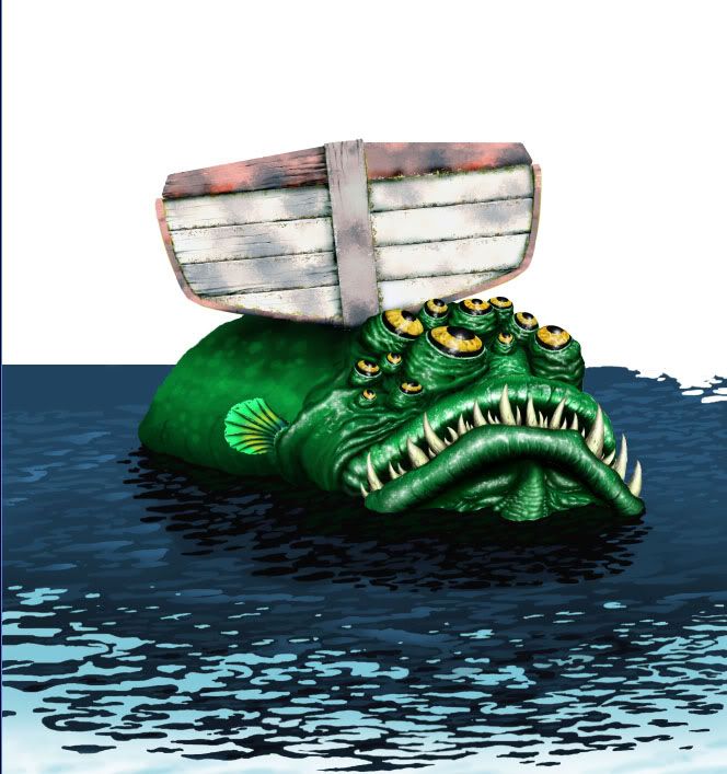
I had to look up what "Flaming Pear Flood" was and man! That would've saved alot of time! Each little ripple was hand (er, mouse) drawn unfortunately (Which is easier to see in the larger image here).


Which was a pain in the ass. That's actually a pretty nifty filter though and thanks for the heads up! :)

As far as a horizon line goes, I had thought about what to do with the background for some time. But I wanted to use a style that Rockwell would use on occasion of setting a blank background with only traces of detail. Unfortunately, a plain white background bleached out the foreground characters so I added the blue so they would pop out a bit more.

You have any owrk? Please show it! This place is deader than Elvis!
Printer Friendly | Permalink | Reply | Top
 
greyl Donating Member (1000+ posts) Send PM | Profile | Ignore Fri Dec-09-05 01:07 AM
Response to Reply #2
3. Holy Shit! indeed :)
I respect the hell out of the fact that you accomplished that without an ez-way plugin.
(the artistic ethics of using plugins as a shortcut may be worthy of a dedicated discussion)

I used the Flood plugin a few years ago when I did the main image for my site zinzang.com, and I have to say it bothers me. For one thing, I know there are some people out there who will say "hey, there's that plugin again". ;) I've been meaning to change it for a while, but being a procrastinating underachiever...


On the horizon thing: I'm no expert on Rockwell, so that particular similarity went over my head. To my eye, the difference between the sharp detailed dark blue water and the expanse of lighter blue is confusing about where the horizon is. It implies that the horizon is closer than it logically is. (again, to my eye) How do you think a blur or softening of that line would work? Iow, remove the sharp distinction between the farthest dark blue and light blue sky so that the horizon is more ambiguous and left up to the viewer to imagine?


Printer Friendly | Permalink | Reply | Top
 
gatorboy Donating Member (1000+ posts) Send PM | Profile | Ignore Fri Dec-09-05 02:55 AM
Response to Reply #3
4. It may also be on account....
That I just got lazy :P Seriously though, the water was originally a lighter hue giving the impression of a smaller body of water, such as a lake. My wife came in and gave it the murkier tone because she thought that my original coloring blended in too much with the fish (Which it did. But that's why she's the color theorist of the family and I'm the "drawer"). With the water looking more like a sea scene, rather than a lake, the quick disappearance of the horizon didn't make much sense, I admit. But by then my ADD kicked in and I wanted to move on to something else.

As far as filters go, hey, if they help, I say use them. If you work on deadlines, the key is speed and as long as you have an impressive piece of work, I don't think using short cuts is an issue. :) It's like when you're a kid and you have set in your mind that a real artist makes everything up from scratch. I recently bought a book on Rockwell's techniques and it was quite an eye opener. From the meticulous way he posed his models, To actually using *gasp* a projector to draw his scene up on canvas.

If you're really interested in digital design, try out the cgtalk.com site. They have a ton of talented folks (Both 2D and 3D) with experience and it's a great place to pick up new tricks of the trade.


Chris
Printer Friendly | Permalink | Reply | Top
 
Lorien Donating Member (1000+ posts) Send PM | Profile | Ignore Fri Dec-16-05 11:22 AM
Response to Original message
5. Fantastic work! The kid and dog definitely capture the spirit
of Rockwell's illustration. Photoshop, eh? I'm a traditional illustrator, but I need to learn to paint digitally. Did you work on a Wacom tablet? How did you start the painting-did you scan in a line drawing first? Does it take more or less time to finish a work in Photoshop? (I have an animator friend at ILM who says that computer animation is far more labor intensive than traditional animation-so it seems like digital painting might be the same). Love to see some more of your work!

Here's a small sample of one of mine:

Printer Friendly | Permalink | Reply | Top
 
gatorboy Donating Member (1000+ posts) Send PM | Profile | Ignore Sun Dec-18-05 12:57 AM
Response to Reply #5
6. Beautiful stuff, Lorien.
Edited on Sun Dec-18-05 01:05 AM by gatorboy
What medium did you use for that? The expression and positioning is great! :)

I have a pretty small tablet, a Wacom CTE-430, which only has a drawing space of 4 x 6 (A few of my friends have the much nicer 12x12 models which leaves me with severe tablet envy :P). I'm pretty new to the pen and have to keep the mouse handy for clicking through the Photoshop menus. Luckily, I'm left handed so I can keep a hand on a pen and one on the mouse at all times.

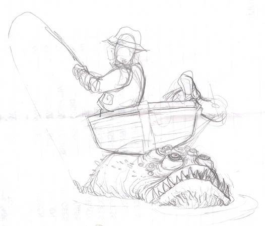
I have to admit, that it IS more time consuming! The process takes alot longer than I anticipated. But I do appreciate the "undo" feature, plus I save alot on paint! ;) I had originally considered a more in-depth pen and ink to start with but I knew I'd be bogged down in the detail, so I scanned in a very rough thunbmail so I could get started:

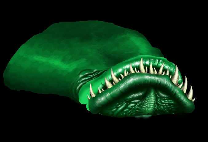
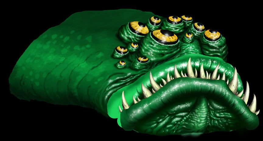
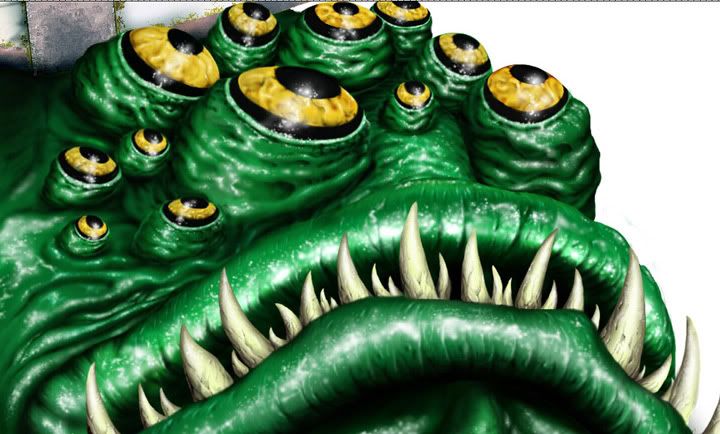
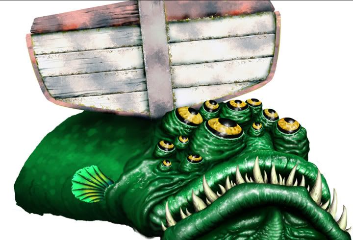
The first thing I started with was the fish since it was going to be created from scratch and I didn't need too much reference material besides some pics of fish and how light reflects on their flesh out of water. One thing that I enjoy about Photoshop is layers! This way I can give each element its own seperate layer and can concentrate on them individually.
Next up was the boat. I used a filtering technique to give the surface a more stained, weathered look and then went in with the brush tool set at a low opacity to work in the detail on each panel. I used the dodge and burn tool to lighten areas and to give others some shading.
As discussed before, the water never quite came out the way I wanted but it was good to get the practice in. I took several shots of a calm pond with a few waves and tried to reinterpret the movement.
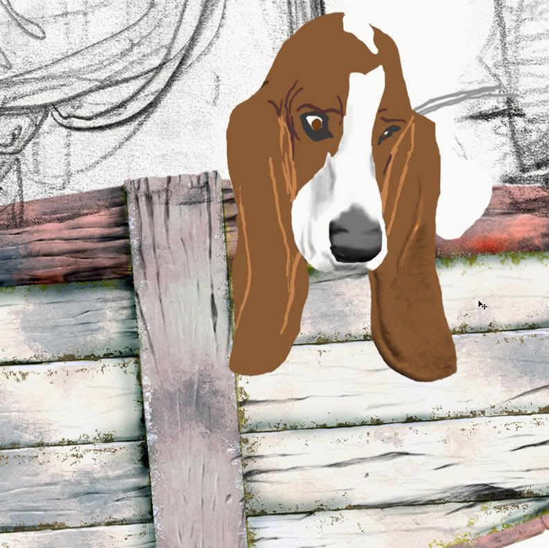
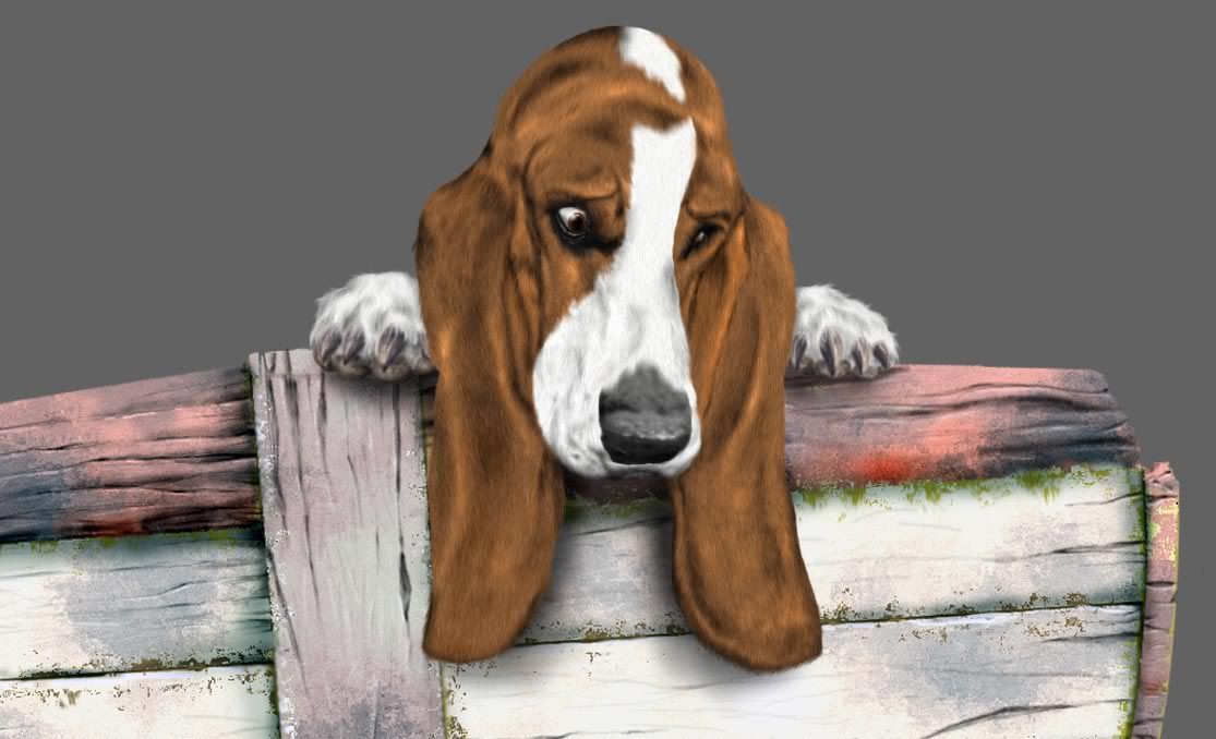
The Basset was painted in very roughly from a photo reference just so I could get the basic shape and a good idea of where the wrinkling was. The fur was actually pretty easy. After I had placed the basic colors, I went back in and would select a small area of the dog. Then I would go in and set 15% noise to the area witch would over pixelate it. After that, I would set a Motion Blur to that same area and angle the blur to which direction the fur would run. For longer haired animals, this trick wouldn't work as well, but since a Basset is so short haired, it worked like a charm!
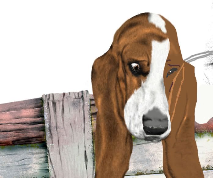
The paws also gave me some trouble. The first time I drew them, a friend commented that they were way too tiny for a Basset. I spotted someone walking their Basset downtown and my friend was right. Those paws are huge on those dogs! The person was kind enough to let me click a few shots of her poor dog and I went back home to redraw them the right size.
Next, I took a photo of my son, leaning over a coffee table for reference and once again, threw down a pretty rough image of him:
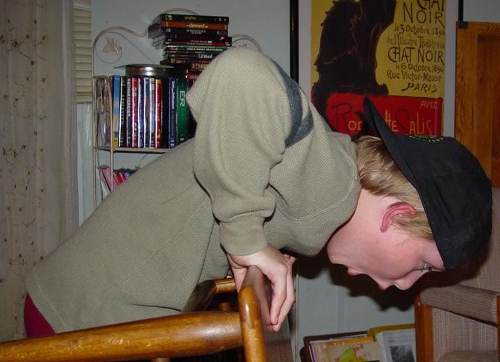
He didn't quite have the facial look I was looking for so I made up most of the facial expressions (Sorry son!) Then I went in and dropped in the coloring along with a textured look of cloth that I had accomplished from using a custom brush.
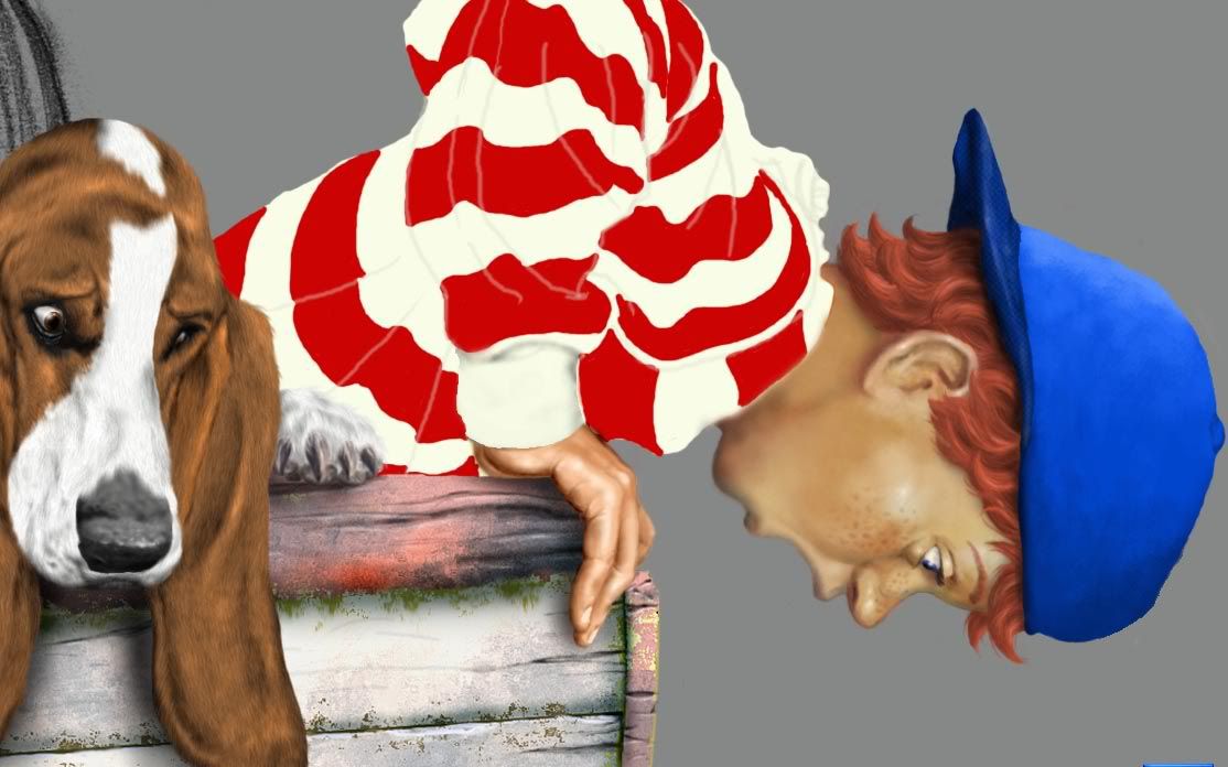
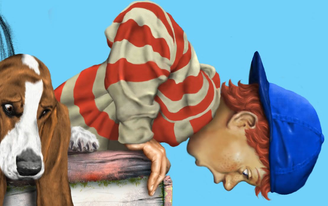
The Grandpa took ALOT longer than I anticipated. I took several shots of a few old folks but didn't have anything prop-wise available at the time to get the position I wanted. So I went home and dressed myself up with a reel and had my wife take a few shots. Afterwards with the shots I liked, I scanned them into photoshop and dropped in the grandpa head over mine so that I had a clear reference shot for the scene. I also picked up quite a few lures to decorate his hat with then went to work on the clothing.
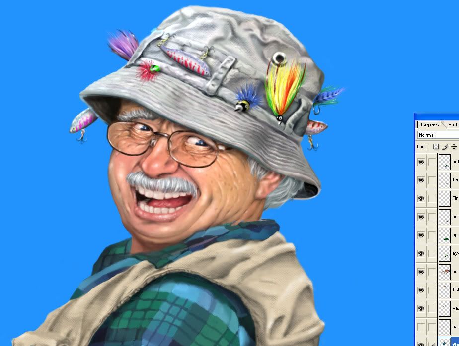
The old man wasn't smiling in the shot so I had to tinker with that, plus a added a mustache because it seemed to give him more of a grandfatherly look.
After that, I was getting pretty tired of the darn thing :P so instead of creating a "No Fishing" sign from scratch, I simply cloned some of the wooden panels from the boat. For the hair on the boy I also used a custom brush that was made to drop in several single hairs at a time and worked over them a few strkes at a time. Sorry for the long tutorial but I thought there might be a few out there that might be curious on how this came together.
Printer Friendly | Permalink | Reply | Top
 
Lorien Donating Member (1000+ posts) Send PM | Profile | Ignore Sat Dec-24-05 08:48 PM
Response to Reply #6
7. It's a GREAT tutorial! I'm going to bookmark it for later reference
I'm especially impressed with the fur technique used on the Basset; did you come up with that by trail and error? My clients all seem to want animal illustrations out of me, and I can see how working digitally would have helped on simple but time consuming illustrations like this one:


I work in acrylic, and I'm starting to feel the same way I did as a traditional animator for Disney; like a dinosaur! I still love the look and feel of a traditional painting, but you're right; the materials are expensive and making changes is far easier in Photoshop.

And I like the way the water turned out! This was my first attempt:


I used a lake at the end of my street here in Florida for reference, but I'm still not happy with it. But, like you, I got sick enough of the piece that I finally just left it alone.

Do you work full time as an illustrator, or are you doing this on your own time?
Printer Friendly | Permalink | Reply | Top
 
Lorien Donating Member (1000+ posts) Send PM | Profile | Ignore Sat Dec-24-05 08:53 PM
Response to Reply #7
8. Lol! I just noticed the "Chat Noir" print in the background
got that in my kitchen. ;-)
Printer Friendly | Permalink | Reply | Top
 
DU AdBot (1000+ posts) Click to send private message to this author Click to view 
this author's profile Click to add 
this author to your buddy list Click to add 
this author to your Ignore list Mon Jan 06th 2025, 03:07 PM
Response to Original message
Advertisements [?]
 Top

Home » Discuss » DU Groups » Arts & Entertainment » Artists Group Donate to DU

Powered by DCForum+ Version 1.1 Copyright 1997-2002 DCScripts.com
Software has been extensively modified by the DU administrators


Important Notices: By participating on this discussion board, visitors agree to abide by the rules outlined on our Rules page. Messages posted on the Democratic Underground Discussion Forums are the opinions of the individuals who post them, and do not necessarily represent the opinions of Democratic Underground, LLC.

Home  |  Discussion Forums  |  Journals |  Store  |  Donate

About DU  |  Contact Us  |  Privacy Policy

Got a message for Democratic Underground? Click here to send us a message.

© 2001 - 2011 Democratic Underground, LLC