| Latest | Greatest | Lobby | Journals | Search | Options | Help | Login |
|
|
|
| Home » Discuss » Topic Forums » Democrats |
|
| papau
|
Fri Nov-17-06 09:07 PM Original message |
| Why don't Democrats use some of the economic facts/charts below? |
|
The owner of the rationalrevolution site, and author of much that is below, has given me his permission to post this information on DU.
In Depth Analysis of American Income and Taxation by - September 23, 2003 Updated - November 17, 2004 The following is an in depth analysis of income and taxes in America, primarily over the past 20 years. The data shows that the tax burden has been shifted from both the highest and lowest income receivers towards middle income receivers, specifically upper middle income receivers, those in the 75th to 94th percentile, i.e. those making between about $65,000 and $150,000 a year. The graph below shows the average pre-tax incomes of the various groups. A quintile represents 20% of the population who file income taxes, so the lowest quintile represents the lowest 20% of income taxes returns that were filed. In the year 2000 128,227,000 income tax returns were filed, so one quintile would represent about 25,000,000 filers. The top 1% represents the widest range of incomes, ranging from $373,000 to hundreds of millions or billions of dollars of income for one year. The average Adjusted Gross Income (AGI) filed for the top 400 income receivers in America for 2000 was $173,915, 617. AGI represents all forms of income such as payroll, capital gains, and gift income minus certain deductions. In 2000 72% of AGI for the top 400 income filers came from capital gains. As you can see from the graph below, despite the fact that people tend to think of professionals such as doctors and lawyers who make two or three hundred thousand dollars a year as being "rich", the incomes of those professionals are closer to that of the average middle class school teacher than they are to those of the average or above average income receiver in the top 1%. 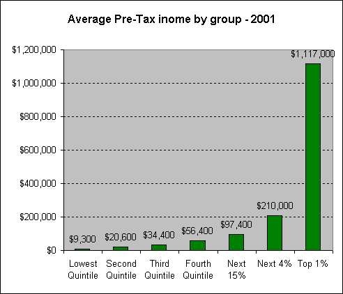 The following graph shows the share of pre-tax national income that the various groups receive. The 59% segment represents the top quintile, which is broken down into its representative parts in the bar graph to the right. Essentially this is showing that the top 20% received well over half of national income in 2001, and that the top 5% (Next 4% and Top 1% combined) received 33% of national income. The bottom 80% of tax filers in America received 41% of national income. By looking at the above graph and the one below you can see roughly what the income was of the those in each segment. 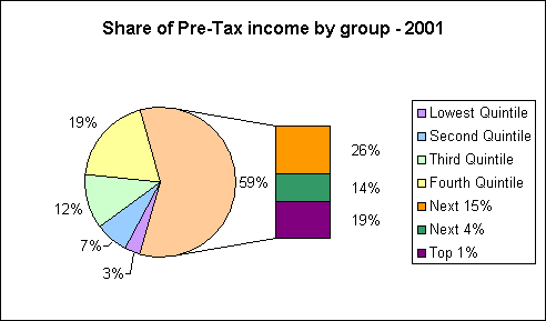 This next graph shows the change in tax burden for each group due to the 2001 tax relief program of President George Bush. Virtually everyone got some form of tax cut, but because some groups got higher cuts than others there was a change in the percentage of overall national income taxes that falls on each individual. Some people are now carrying a smaller portion of the total tax burden than they were prior to the tax relief and some are carrying a larger portion of the total burden. This graph shows who's load was lightened in reference to the entire tax burden. As you can see the top 1% did indeed receive the largest decrease in their tax burden. The tax burden was generally shifted to middle and upper middle income receivers by the Economic Growth and Tax Relief Reconciliation Act of 2001. 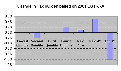 http://www.taxpolicycenter.org/TaxFacts/overview/egtrra.cfm The following graphs deal with the distribution of the three major types of income, Labor, Capital, and Transfer. The income being used here is Family Economic Income (FEI), which includes more types of income than the more typically used cash income measures. Labor income includes pre-tax wages, fringe benefits (employer provided healthcare, etc), and self employment income. Capital income includes interest, pre-tax corporate profits, non-stock capital gains, pension and IRA benefits, and receipts on IRA and life insurance assets (note that profits from the sale of stocks are not reflected in this data). Transfer income includes Social Security, Supplemental Security Income (SSI), Temporary Assistance for Needy Families (TANF), Low Income Home Energy Assistance (LIHEA), veteran's compensation, workers compensation, and food stamps. For a further explanation see: http://www.ustreas.gov/ota/ota85.pdf page 18. 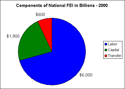 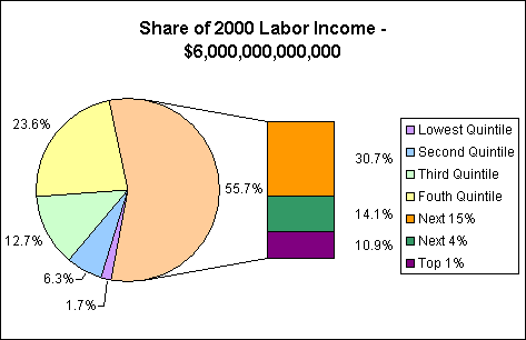 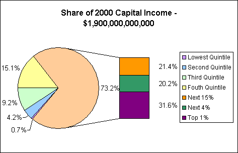 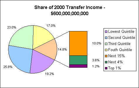 The graph below shows the percentage of each of type of income received by each percentile of the population, starting at the 10th percentile. So, for example, the 50th percentile received approximately 0.64% of the nation's income, which is to say that the ratio of households to national FEI dollars is 1:0.64, or all of the households in the 50th percentile receive about 3/5ths of one slice of the national FEI. The X axis for the graph is on the 1% line. Where the series crosses the X axis is where families receive a 1 to 1 share of the national FEI. For labor income this point is at about the 65th percentile, which is to say that this is the point where income distribution is equal to family distribution. One way to see this would be to call this the "fair share" point. Families behind this point are receiving a smaller portion of national income than they represent numerically, households in front of it are receiving a larger percentage of income than they represent numerically. If, in theory, everyone in America received the same amount of labor income, what we would all receive is the amount of income that those in the 65th percentile currently receive. 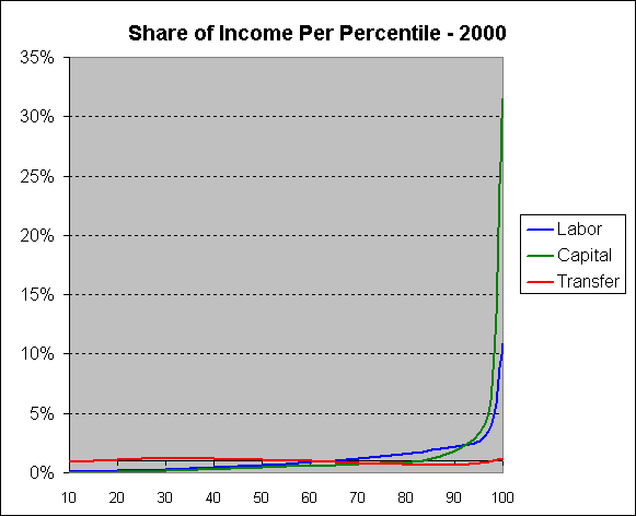 The graph below shows the composition of income for each of the groups, i.e. the portion of income that is of each type. The table below the graph gives the dollar value in billions for each of the groups. For example the Lowest Quintile receives for $102 billion dollars of the nation's total labor FEI and $115 of the nation's total transfer FEI. Even though transfer income makes up a smaller share of the Second and Third Quintile's income than the Lowest Quintile, the Second and Third Quintile receives a larger amount of transfer income in terms of dollars. Remember that Social Security makes up a large portion of the transfer income for all quintiles. 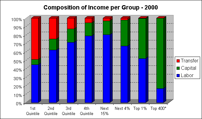 * The Top 400 data comes from a separate source and is based on AGI, and is thus not directly comparable to the FEI data, however it is close enough for a general comparison. Total Dollars in Billions per Group Labor Capital Transfer Total Lowest Quintile $102.00 $13.30 $115.20 $230.50 Second Quintile $378.00 $79.80 $154.80 $612.60 Third Quintile $762.00 $174.80 $138.00 $1,074.80 Fourth Quintile $1,416.00 $286.90 $102.00 $1,804.90 Next 15% $1,842.00 $406.60 $60.00 $2,308.60 Next 4% $846.00 $383.80 $21.60 $1,251.40 Top 1% $654.00 $589.00 $7.20 $1,250.20 This graph shows the three forms of income stacked on top of each other to represent total income for each percentile, allowing you to see what portion of what type of income makes up the income for the population. The graph is made from seven data points, which are marked by the vertical lines extending to the X axis. 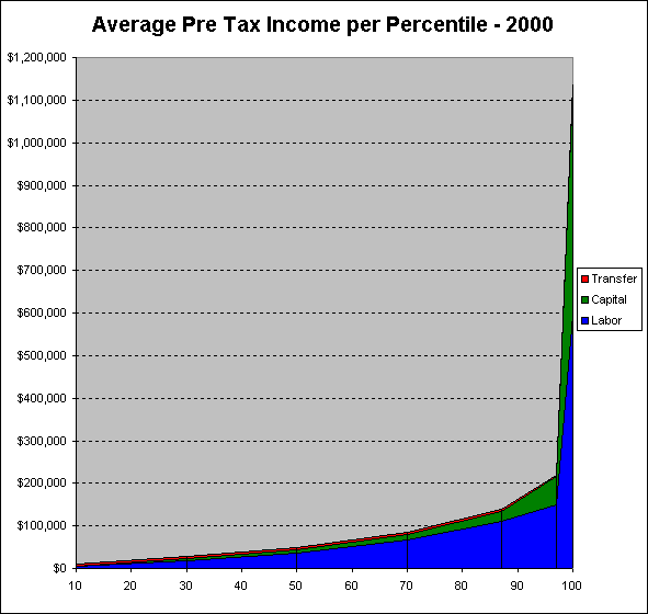 Labor Capital Transfer Total 10th $4,615.4 $601.8 $5,212.7 30th $18,173.1 $3,836.5 $7,442.3 50th $35,277.8 $8,092.6 $6,388.9 70th $67,109.0 $13,597.2 $4,834.1 88.5th $110,299.4 $24,347.3 $3,592.8 97.5th $148,421.1 $67,333.3 $3,789.5 100th $594,545.5 $535,454.5 $6,545.5 http://www.ustreas.gov/ota/ota85.pdf The graph below shows the breakdown for the shares of type of income for 2004 compared to the share of total federal taxation that is levied on those forms of income. The small amount of taxation on transfer income comes primarily from the taxation of Social Security income. As you can see, income from labor is disproportionately taxed. Although 71% of reported receipts in 2004 came from wages, 88% of federal personal taxes were raised from wages. While 22% of personal income in 2004 came from capital gains, only 11% of federal personal taxes were levied on this form of income. This is because capital gains are taxed at a rate significantly lower than wages. As the data above shows, capital income goes disproportionately to the wealthiest Americans. 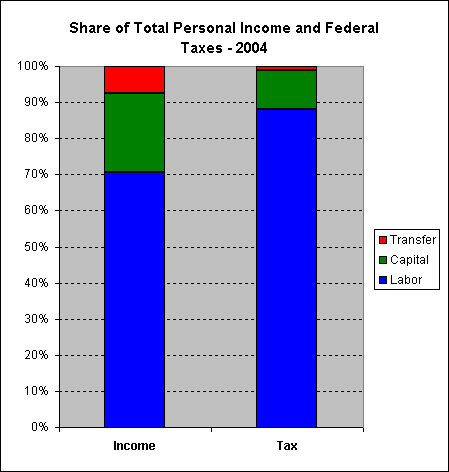 http://www.itepnet.org/earnan.pdf In comparison to these figures we can see the 2000 incomes of George Bush and Dick Cheney: the vast majority of both of their incomes coming from capital. Dick Cheney did not release his entire tax filing so the exact figure of his gross income is not known for 2000, just his adjusted gross income, AGI. For that reason I am not able to calculate his federal income tax rate, however George Bush paid 26.86% of his 2000 income to federal income tax. *Reported AGI, not gross income. 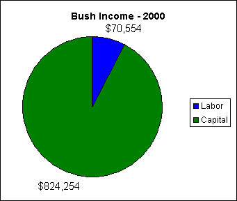 http://www.taxhistory.org/Presidential/bushtaxreturn.pdf http://www.taxhistory.org/Presidential/cheneytaxreturn.pdf Prior to World War II virtually all federal taxes were paid by the wealthiest members of society. Less than half of American workers paid any income tax at all prior to WWII. In order to fund the war income taxes were increased and the majority of workers had to pay income taxes for the first time, but even after the war federal taxes on average Americans remained very low. As federal tax rates on the wealthy were decreased starting in the 1960s, the tax burden on middle and low income Americans began to grow. While most people are aware of the rates of the various income tax brackets, many people don't realize that you actually pay a significantly lower portion of your income to taxes than is indicated by the income tax bracket that you fall into. In 1979 the top income tax bracket was 70%, Reagan then cut the top tax bracket to 50% and in his second term he cut it again to 28%. It has since come back up as high as 39% under Bill Clinton. However, no one actually pays these rates. Those rates also only represent federal income taxes on earned income, but there are also your Social Security taxes, capital gains taxes, estate taxes, and excise taxes, etc. The graph below shows the total effective tax rate of all federal taxes combined for each of the groups: income, plus Social Security, plus estate, plus excise, plus capital gains, etc. As you can see from the graph, even those combined rates are below what the rates are for the income tax brackets that correspond to the groups. We all actually pay a much lower amount in taxes than most people think we pay. As an example, the income tax paid by even the top 400 receivers in 2000 was only 22% of their AGI, and that is for people averaging over 170 million dollars a year in income, again that is partly because over 70% of that group's income came from capital gains. There is only one group that paid a higher rate of federal taxes under Clinton than they were 20+ years ago in 1979 under Carter, and that is the group labeled Next 10%, or the 80th to 89th percentile; upper middle income receivers. In 1979 the total effective federal tax rate for that group was 25.4% and in 2001 it was 26.3%. Another interesting thing that the graph reveals is that during the Reagan years taxes were increased on the lower income segments and dramatically decreased on the upper income segments. The majority of this increase on the lower segments came in the form of excise taxes. What you can also see is that despite more than 20 years of political tough talk about taxes, the tax rates for the middle income receivers have stayed roughly the same. As you can see if you visit the link to the source data, excise and Social Security taxes have increased significantly on middle income receivers over the years pretty much negating any decrease in income taxes. The most significant change in tax rates has been for the top 1%, whose overall federal tax liabilities as a percentage of AGI are now significantly less than they were in 1979, even though they did come back some up during the 90s. Federal tax rates under George W. Bush were reduced across all income levels, however the reductions were the greatest on the top 1%. The change for the top 1% was a reduction of 6.8%, while the reduction for the bottom 80% averaged 1.9%. Despite these federal tax reductions, taxes have generally increased at the state and local level to make up for the reductions in federal funding, effectively negating most of the federal tax reductions. 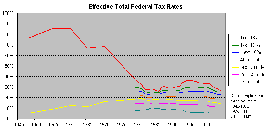 http://www.cbo.gov/showdoc.cfm?index=4514&sequence=3&from=0 http://www.cbo.gov/showdoc.cfm?index=5746&sequence=1#pt4* Top 1% Top 5% Top 10% Fifth Quintile Fourth Quintile Third Quintile Second Quintile Lowest Quintile Effective Individual Income Tax Rate 1979 21.8% 19.0% 17.4% 15.7% 10.1% 7.5% 4.1% 0.0% 2000 24.2% 21.6% 19.7% 17.5% 8.1% 5.0% 1.5% -4.6% Effective Social Insurance Rate 1979 0.9% 2.8% 4.2% 5.4% 8.5% 8.6% 7.7% 5.3% 2000 1.9% 3.8% 5.0% 6.3% 10.4% 9.6% 9.4% 8.2% Effective Corporate Income Tax Rate 1979 13.8% 9.5% 7.4% 5.7% 1.6% 1.4% 1.2% 1.1% 2000 6.8% 5.4% 4.5% 3.7% 1.0% 1.0% 0.6% 0.5% Effective Federal Excise Tax Rate 1979 0.5% 0.6% 0.7% 0.7% 0.9% 1.1% 1.3% 1.6% 2000 0.3% 0.4% 0.5% 0.6% 0.9% 1.2% 1.4% 2.2% Total Effective Federal Tax Rate 1979 37.0% 31.8% 29.6% 27.5% 21.2% 18.6% 14.3% 8.0% 2000 33.2% 31.1% 29.7% 28.0% 20.5% 16.7% 13.0% 6.4% 2004* 26.7% 25.6% 24.9% 23.8% 18.5% 14.6% 11.1% 5.2% The following graph shows the change in the share of total federal tax liabilities among the various income groups between 2000 and 2004. Similarly to the EGTRRA data from 2001, this shows tax burden being shifted to the middle class. 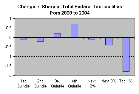 http://www.cbo.gov/showdoc.cfm?index=5746&sequence=1#pt4 The graph below shows slightly longer term household income trends. What is not reflected in this data is the number of workers per household, which has generally risen among all income brackets over the past 50 years, especially among the middle class. As you can see though the incomes reported by the bottom 80% of American working households have changed only slightly since the 1960s even with an increase in two and three worker households, while the incomes of the top 5% of households has gone up dramatically. 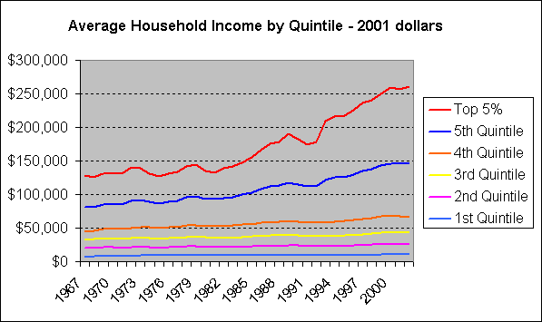 http://www.census.gov/hhes/income/histinc/ineqtoc.html This graph is very similar to the one above, however it does show the top 1% broken out as a separate series, and as you can see that is where the most dramatic rise in income occurs. The graph below is slightly different in some other ways as well. This data is adjusted for household size, unlike the graph above, and the range of data is not as great, it only goes back to 1979. This graph is also significant because it shows after tax income, so this is what was taken home after all federal taxes were paid. Below the graph is a table showing the data for 1980 and 2000, and below that is a row titled "Even", which shows what incomes would have been like in 2000 if the average income growth (1.4 times) for that period had occurred evenly. 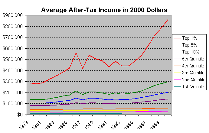 http://www.cbo.gov/showdoc.cfm?index=4514&sequence=3&from=0 Average After-Tax Income by Quintile Top 1% Top 5% Top 10% 5th Quintile 4th Quintile 3rd Quintile 2nd Quintile 1st Quintile 1980 $280,300 $135,500 $103,600 $81,500 $46,100 $35,200 $24,600 $12,200 2000 $862,700 $299,400 $201,400 $141,400 $59,200 $41,900 $29,000 $13,700 Even $392,557 $189,700 $145,040 $114,100 $64,540 $49,280 $34,440 $17,080 Here we get an even longer range view of income trends. This shows after tax income in 2000 dollars going back to 1913 for the top 1% and the average for the remaining bottom 99%. http://www.aflcio.org/corporateamerica/paywatch/ Below we can see the median income of American workers since the 1950s. The median income is the income of the middle segment of the working population. What this shows is that for men there has been a general stagnation in terms of income for the average American worker since the 1970s. 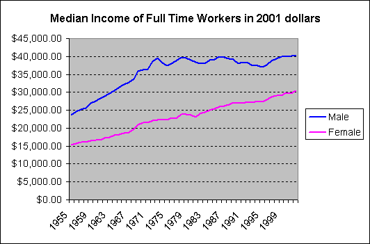 http://www.census.gov/hhes/income/histinc/ineqtoc.html The graph below shows change in family incomes for two distinct periods in American history: the immediate post-war period, and then the post-Reagan period. During the post-war period from 1947 to 1979 American family incomes all rose together at relatively equal rates, with the biggest gains among the poor and middle-class. Since the Reagan era, income growth has been dramatically isolated among the top 5%. The small gains for the poor and middle-class are actually less impressive than this graph shows because of the large increase in two and three worker households since 1980 among those groups. Much of the small increase in family incomes for the bottom 80% during the post-Reagan era has been due to the rise in working women. 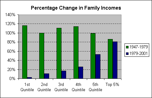 http://www.faireconomy.org/research/income_charts.html This graph can be a little tricky to read, I have the top income receiver at the bottom and the bottom at the top. I did that so that you can more easily read the percentage of income received by the top receivers. The blue, green, and red series together make up the top 10%, red and green comprise the top 5% and so on. The bottom half of income receivers are represented by the aqua color, and as you can see they receive close to only 10% of the total National Income. The graph shows which segments of the income receivers have been gaining and loosing share. As you can see, the top 50% accounts for more income today than they did in 1980, but that does not mean that every segment of the top 50% has gained a share of income. In fact the only segments to actually have gained in share of national income are members of the top 5%. This can more easily be seen in the summary table below the graph. 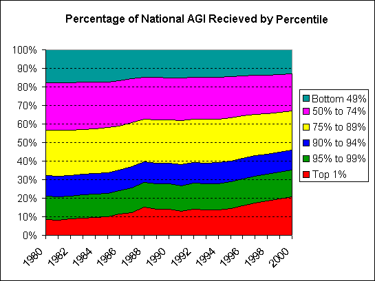 Share of National AGI by Percentile Top 1% 95 to 99 90 to 94 75 to 89 50 to 74 Bottom 49% 1980 8.46% 12.55% 11.12% 24.57% 25.62% 17.68% 2000 20.81% 14.49% 10.71% 21.14% 19.86% 12.99% Share of National AGI by Group Top 1% Top 5% Top 10% Top 25% Top 50% Bottom 49% 1980 8.46 20.01% 32.13% 56.70% 82.32% 17.68% 2000 20.81 35.30% 46.01% 67.15% 87.01% 12.99% The two graphs below represent the data in the Share of National AGI by Percentile table above. Although not completely useful in themselves, as a comparison between 1980 and 2000 the contrast becomes striking. 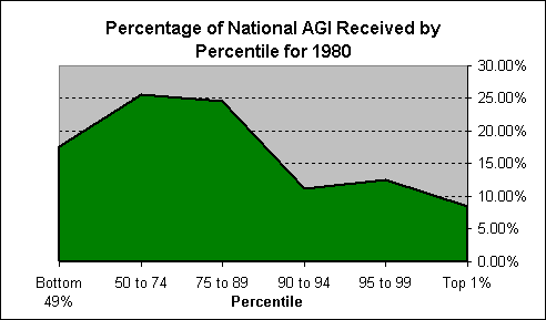 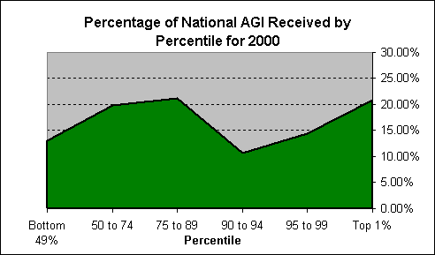 The graph below is of a similar nature to the one above. It is showing the ratio of the share of income to the population of each segment. In this case a value of one would mean that that group received an equal portion of the share of income to the portion of that group's share of the total income tax filing population. In other words if that group represents 20% of the population and received 20% of the after tax income then that would be a one to one relationship, or a value of one. The labels are only for the 2000 values, with the exception of the top 1% where I showed both values. As you can see, between 1979 and 2000 the ratio of income per household doubled for the top 1%, and the ratios for all members of the bottom 95% decreased between 1979 and 2000. Keep in mind that this is all showing after tax income, meaning the income received after all federal taxes have already been paid. Obviously claims that the top 1% are being over taxed or have been unfairly taxed over the past 20 years cannot stand up in light of this type of analysis. 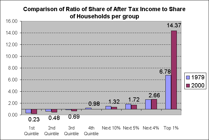 This graph is one of the most important graphs because it shows the share of Total Federal Tax liability for each group, unlike most graphs that you see which only show Income Tax liability, as I will discuss later. Like the graph above titled Effective Total Federal Tax Rates this graph includes all forms of taxes, income taxes (payroll, capital gains, etc), Social Insurance taxes, corporate taxes, and excise taxes, so this takes all federal taxes into consideration, not just income taxes. 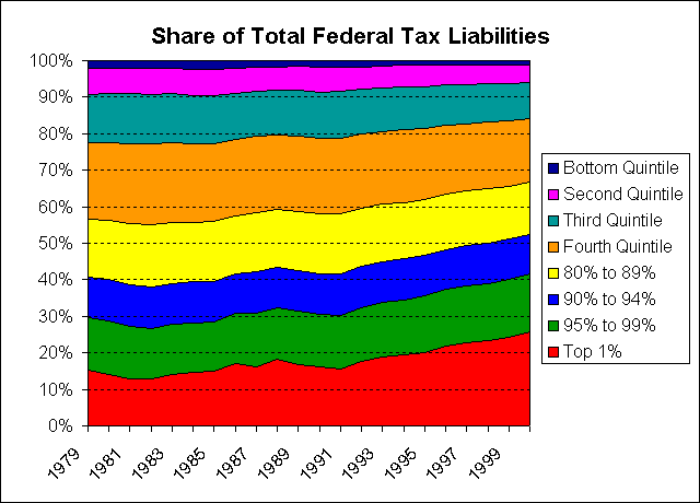 http://www.cbo.gov/showdoc.cfm?index=4514&sequence=3&from=0 Share of Total Federal Tax Liability Top 1% 95 to 99 90 to 94 80 to 89 4th Quintile 3rd Quintile 2nd Quintile 1st Quintile 1979 15.4% 14.2% 11.1% 15.7% 21.0% 13.2% 7.2% 2.2% 2000 25.6% 15.8% 10.8% 14.5% 17.4% 9.8% 4.8% 1.1% The graph below uses the data from the Share of AGI by Percentile along with the Share of Total Federal Tax Liability tables to show the change in the ratio of the share of total tax liability to the share of income. Because of the data that I have available I'm only able to show this breakdown in detail for the top 10%, and the bottom 90% is shown as one group. The calculated values are below the graph. The ratio of share of taxes to share of income for the top 1% in 1979 was 1.82. That means that in 1979 the top 1% paid a 1.82 times greater share of total federal taxes than they received as a share of total national income. They received 8% of the income and paid 15% of the total federal taxes. In 2000 that ratio had dropped to 1.23, meaning that the top 1% in 2000 was paying 1.23 times their share of income to the share of federal taxes. They received 20% of the income and paid 25% of the federal taxes. You can also see that in 2000 the ratios for the bottom 95% of payers actually increased slightly from 1979. This all indicates a shift in the total federal tax burden, primarily to the upper middle income payers. Despite the fact that this graph does not look like much, I consider it to be the most important of all the graphs because it shows exactly the real shift in total federal tax burden since 1979. 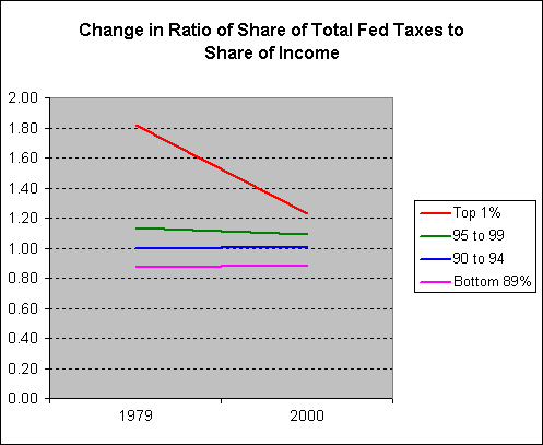 Ratio of Share of Total Federal Tax Liability to Share of National Income Top 1% 95 to 99 90 to 94 Bottom 89% 1979 1.82 1.13 1.00 0.87 2000 1.23 1.09 1.01 0.89 This next graph is one that shows data that is somewhat popular among those that complain that the share of income taxes paid by the top 1% has gotten too high. Unlike the previous graph that shows all federal taxes, this one only shows the share of federal income taxes that are paid by each group. As the graph shows the share of income taxes paid by the top 1% has gone up dramatically, having been less than the share paid by the middle income payers in the 1980s, the top 1% now pays a larger share of income taxes than any of the other groups listed below. It shows that middle income payers account for a smaller share than even the 95th to 99th percentile payers. This of course is not the whole story, because as we have already seen the share of income for the top 1% has also gone up dramatically as well, and income taxes are not the only federal taxes 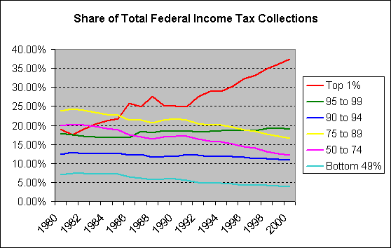 This graph now shows the real change in income tax burden over time. This graph shows the ratio of share of income taxes to share of income over time for each group. For example, in 1980 the top 1% was paying 2.25 times their share of federal income taxes to their share of national income. In other words, they received 8.46% of the nation's income and paid 19.05% of the nation's income taxes. Their share of taxes was 2.25 times that of their share of income. Over time this ratio has decreased and in 2000 they paid only 1.8 times their share of income to their share of federal income taxes. So, contrary to what many people try to claim, the federal income tax burden on the top 1% is definitely decreasing. As you can see, the ratio of share of taxes to share of income has decreased for all groups since 1980, but it has decreased the most for the top 1% and decreased the least for the upper middle income payers. 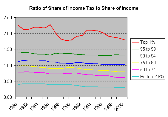 This graph shows overall income tax burden flatness, as measured by the difference between the ratio of the share of income taxes to share of income for the top 1% and the bottom 49%. A value of zero would mean that all segments of the population would be paying the exact same portion of federal income taxes as the portion of federal income that they receive. The closer the value is to zero the less progressive the income tax structure is. The trend shows that since 1980 the income tax system has become less progressive. 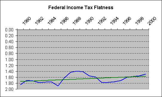 The next several graphs offer more analysis of income and income tax trends. Today we hear a lot about the fact that the wealthy pay the majority of income taxes, and this is true, but as the data below shows, the increase in share of national income by the top 1% has far outpaced the increase in their share of the federal income tax burden. Yes they pay a larger portion of income taxes now, but they also receive a much larger portion of the national income. This graph shows the difference in the share of the national income between 1980 and 2000 by the various groups. This graph does not show the percentage of that change, but rather the change in percentage. For example the graph shows that the top 1% received 12.35% more of the national income in 2000 than they did in 1980. 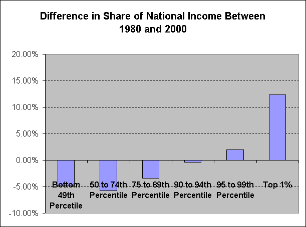 This graph shows the difference in the share of national income taxes between 1980 and 2000. Like the graph above this graph shows that the top 1% has also seen the largest increase in the share of income taxes paid. You will also notice that the difference between the share of the national income taxes paid by the top 1% between 1980 and 2000 is greater than the difference in their share of the income. This may look at first like they are now paying a larger portion of the taxes than is appropriate for the change in their share of the income, but this is addressed by the next graph. 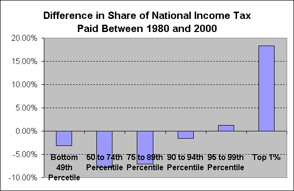 This graph shows the actual change in the share of both income and income taxes between 1980 and 2000. This graph shows that the change in the share of income for the top 1% was greater than the change in the share of the tax burden. In other words, the top 1% received a 146% larger share of the national income than they did in 1980 while their share of income tax payment only grew by 96%, so the change in their share of income grew at a higher rate than the change in their share of income taxes. Likewise, you can see that the change in the share of income taxes paid by the lower income brackets dropped more than the change in their share of income. 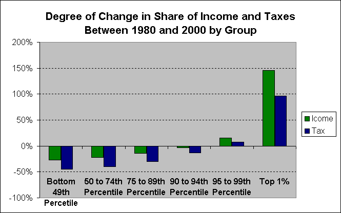 This graph is a measure of the change between share of income vs. share of income taxes. This shows that the top 1% has indeed seen the highest benefit between 1980 and 2000. The change in share of income received by the top 1% was greater than the change in the share of income taxes by fifty percentage points. 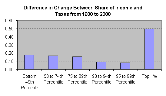 This graph now shows the degree of difference in change between income taxes and income for each group. Again, the top 1% comes out on top. So, not only has the top 1% seen the largest numerical gains in the share of national income and the largest numerical gains in share of untaxed income, but it has also seen the largest portion of gains in the share of untaxed income in the United States since 1980. The lowest income segments of the population have seen a decrease in share of national income and share of national income tax, however the difference between the change in share of income vs. taxes is not as great as it is for the top 1%. 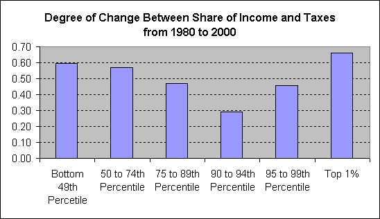 http://www.taxfoundation.org/prtopincometable.html Federal Tax burden, as the data above shows, has been shifted towards the upper middle income receivers since 1980, who have also seen a decrease in share of the national income. The largest portion of this shift has come not from the lower income brackets, but from the top 1%. The shift in tax burden is most significant when you take all federal taxes into consideration, but the data above shows that there has been a shift in the tax burden even among just federal income taxes. Federal taxes are not the only taxes that Americans pay however, we also pay state and local taxes as well. Though the federal income tax was originally created as a highly progressive tax, state and local taxes have been predominately regressive historically, and remain so today. Rates of taxation, and how progressive or regressive local taxation is, varies from state to state, and even among cities and counties, however, most state and local tax systems are regressive. 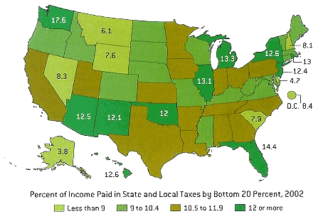 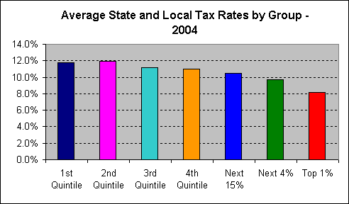 Now, after all of the discussion of federal taxation, and showing that federal taxation itself is becoming increasingly less progressive, the graph below shows total effective tax rates by group including all forms of taxation: federal, state and local. As you can see, when all taxes are taken into consideration the tax rate for all income groups is very similar. In fact, the total tax rate for the top 40% of Americans (those receiving anywhere from $50,000 a year to $500,000,000+) is about the same. 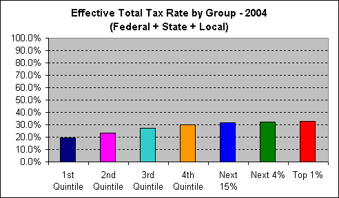 http://www.ctj.org/pdf/fsl2004.pdf 1st Quintile 2nd Quintile 3rd Quintile 4th Quintile Next 15% Next 4% Top 1% 19.7% 23.3% 27.0% 29.8% 31.6% 32.2% 32.8% This next graph, perhaps, sums everything up best. Though so much is heard about how the wealthy pay a hugely disproportionate share of taxes, this simply is not the case. Virtually every time someone makes the claim that the wealthy pay a disproportionate amount of the taxes they are discussing only federal income taxes, because the federal income tax is the most progressive major tax in America. However, when all taxes are taken into consideration every group is currently paying a roughly equal share of taxes to their share of national income, and in fact the ratios of shares of income to shares of total taxes is much more equal now than it has been any time since reasonably reliable income and taxation data has been recorded, which covers about the past 60 years. Traditionally in America, throughout virtually all of American history, taxes have been levied most heavily on the wealthy, and this was especially true during the first 80 years of the 20th century. Prior to World War II income taxes were levied exclusively on the wealthy. 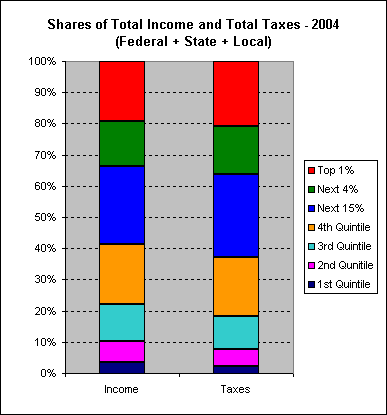 http://www.ctj.org/pdf/fsl2004.pdf Below is a graph showing the historical minimum wage and the unemployment rate in America together. There has always been a lot of talk that the minimum wage causes unemployment. Where is the proof? If this were true then we should expect to see a rise in unemployment that corresponds to every rise in minimum wage in the graph below, but in fact we see almost the opposite of that. The truth is that many factors affect the unemployment rate, not just minimum wage, and in many cases it is not the minimum wage that is the determining factor in the unemployment rate. In fact the Federal Reserve plays a large part in regulating the unemployment rate through the use of interest rates and other elements of fiscal policy. The Federal Reserve attempts to maintain the unemployment rate around 5%, and considers under 5% unemployment to be "too low". Because of this the Federal Reserve's fiscal policy is often a major factor in buoying the unemployment rate, not the minimum wage. As you can also see, the time of lowest unemployment in America during the past 50 years was during the 1960s when in fact the minimum wage was at its highest. The minimum wage today is now lower than it was in 1950 when adjusted for inflation. 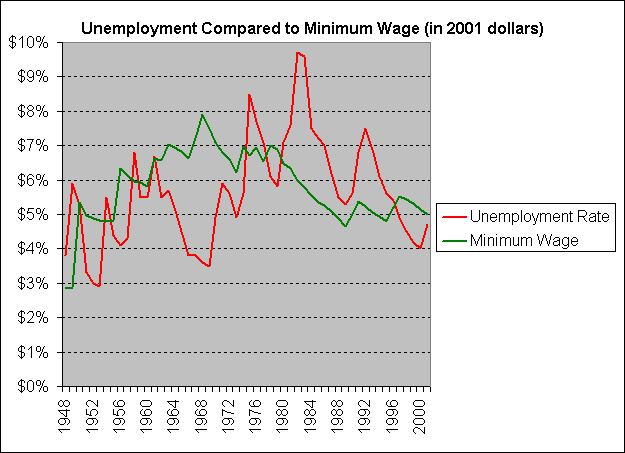 http://pw1.netcom.com/~rdavis2/awages.html This graph shows both average hourly earnings and the minimum wage together in 2001 dollars. As you can see, both the minimum wage and average hourly earnings reached their peak in the 1960s and 1970s. This graph does not go back any farther than 1960, but for all practical purposes the peak shown here in 1973 is the historical peak for hourly earnings in America. See the source data in the link below for details on hourly earnings. 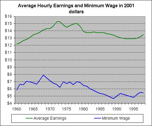 http://w3.access.gpo.gov/usbudget/fy2000/sheets/b047.xls Here is the minimum wage shown as a percentage of average hourly earnings. For example in 1968 the minimum wage was 56% of the average hourly wage. In 1989 the minimum wage was only 35% of the average hourly wage. What this shows is the difference between the minimum wage and average wages. During the 1960s someone making minimum wage was making about half or a little over half what average wages were. In the 1980s and 1990s someone making minimum wage was making about 40% of, or less than 40% of, what the average was, so this shows minimum wage receivers falling farther behind the average wage. 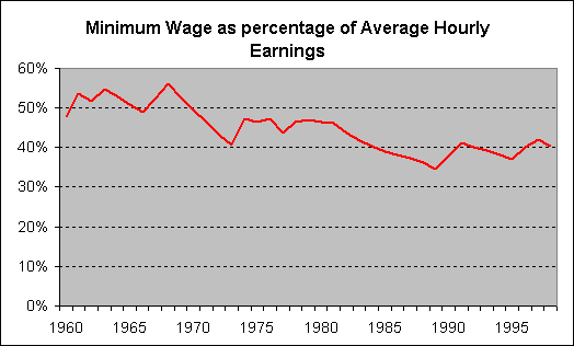 Just as a basic point of reference, I have included below a graph showing the same data that was shown in the very first graph, but with the average income of the top 400 from 2000 added to it to get an idea of scale. This is not a completely accurate graph because it is using data from 2000 and 2001 together and because the top 400 are a component of the top 1% so the top 400 income is part of the top 1% average, which brings the average income of the top 1% up. In addition, I am using gross pre-tax income for the 2001 data and AGI (which includes some deductions) for the 2000 data. If I were staying true to form then I should have a group of the top 1% minus the top 400, but I simply do not have that data on hand, but this rough comparison is good enough to get an idea of the differences in income among the different groups. If all of the corrections were made to make the top 400 data completely comparable to the 2001 data then the differences would be even more pronounced, so this graph is not quite as dramatic as it would be with totally accurate data.  Many "respected" institutions, such as CATO are continuing to present information on taxation and income in a biased and deceptive manner. Many politicians and media pundits, and even financial analysts, are continuing to claim that the tax burden has been increasing on the top 1% of tax payers. Politicians often misrepresent information to upper middle class voters telling them that taxes on the wealthy are too high and thus high end taxes need to be cut. This message connects with upper middle class tax payers because they are actually the ones who really have been seeing an increase in the tax burden, but what is not apparent is that that increase has not come from the lower segments of income receivers, it has come from above them from the top 1% of income recipients, whose tax burdens have been pushed it off onto the upper middle class. The assumption from people in the upper middle class is that if taxes are getting worse for them, then they must be getting even worse for those above them, but this is not the case. The burden is really increasing on those people making between about $60,000 and $150,000 or $200,000 a year, but once you get above that into the $500,000+ a year incomes the tax burden has been greatly reduced over the past 20 years. From CATO: http://www.cato.org/research/fiscal_policy/2002/factsfigs.html "The highly graduated or "progressive" nature of the federal individual income tax results in a very small minority of Americans paying a massive share of the $1 trillion of annual income tax revenues. The highest-income 1 percent of households pay 36 percent of individual income taxes, and the top 5 percent of households pay 56 percent, based on the most recent IRS statistics." "The federal income tax burden has been become increasingly skewed towards households with the highest incomes. The share of all individual income taxes paid by the highest-income 1 percent of households has increased from 19 percent in 1980 to 36 percent in 1998." This organization, which is a large and respected one by many people and has powerful influence in economic issues, is presenting a fallacy, and this fallacy is repeated by thousands of other influential organizations and individuals in America. Here I have presented the facts that prove beyond a shadow of a doubt that this is incorrect. First of all they are only presenting income tax information and income taxes are not the only taxes that people pay. Total tax burden is what is important, not just what the name is on the tax; ultimately tax is tax, it all comes out of your paycheck and goes to government, whether it's excise tax or income tax makes no difference at the end of the day. Secondly I have shown that even the income tax system has been getting less progressive even since 1980, and it was actually much more progressive from the time it was first developed up to 1980. As the income tax system has gotten less progressive over the past 20 years the share of income tax paid by the top 1% has increased. Making the system less progressive will not necessarily decrease the share of income taxes paid by the top 1%. The primary reason that the share of taxes paid by the top 1% has gone up over the past 20 years is because the incomes of those in the top 1% have gone up at a rate much higher than that of other Americans. Over the past 20 years the salaries of corporate executives have grown by a factor of more than 10. In 1982 the average corporate executive was paid about 42 times the salary of the average employee. In 2002 that figure had increased to 500 times the compensation of the average employee. Commenting on this turn of events, William J. McDonough, chairman of the New York Federal Reserve Bank, said, "I find nothing in economic theory that justifies this development, I am old enough to have known both the CEOs of 20 years ago and those of today. I can assure you that we CEOs of today are not 10 times better than those of 20 years ago." See: Fed official decries CEO salaries In February 2002 top economic officials met to discuss corporate governance and the state of the American economic system. The Chairman of the Federal Reserve, Alan Greenspan, shared his view that there were fundamental problems with corporate governance in America in how corporations and executives have been manipulating the system for the past 20 years. Others in the room tried to downplay his concerns. Dr. Greenspan would make is point: "There's been too much gaming of the system until its broke. Capitalism is not working! There has been a corrupting of the system of capitalism!" - Dr. Alan Greenspan - Chairman of the Federal Reserve, February 22, 2002 OTHER RESOURCES - ORIGINAL RESOURCES - OTHER INTERESTING FACTS: * Why did the wealth of the bottom 40 percent go down 76 percent from 1983 to 2000 while the wealth of the richest 1 percent increased 42 percent? * Why did the income of the bottom 40 percent only go up 7 percent from 1979 to 2000 while the income of the wealthiest 5 percent went up 81 percent? * Why did the top 5 percent of Americans gain 70 percent of all the new wealth created from 1983 to 1998 while the bottom 80 percent of the American people got only 9 percent of the new wealth? * And why did the longest sustained period of economic growth and shared prosperity occur when the CEOs of large corporations earned 41 times as much as an average worker, as compared to the economic boom of the 1990s when CEO salaries skyrocketed to 531 times an average worker’s salary and brought enormous wealth to only a small sliver of very rich people? The top 1% :from $373,000 to hundreds of millions or billions of dollars of income for one year. The average Adjusted Gross Income (AGI) filed for the top 400 income receivers in America for 2000 was $173,915,617. AGI represents all forms of income such as payroll, capital gains, and gift income minus certain deductions. In 2000 72% of AGI for the top 400 income filers came from capital gains. 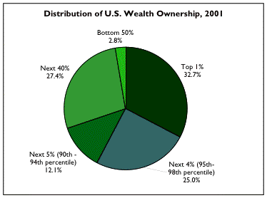 http://www.ufenet.org/research/wealth_charts.html 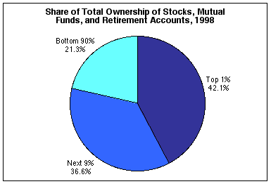 http://www.ufenet.org/research/wealth_charts.html 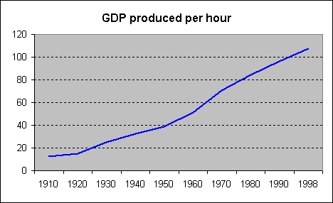 http://pw1.netcom.com/~rdavis2/wagegap.html 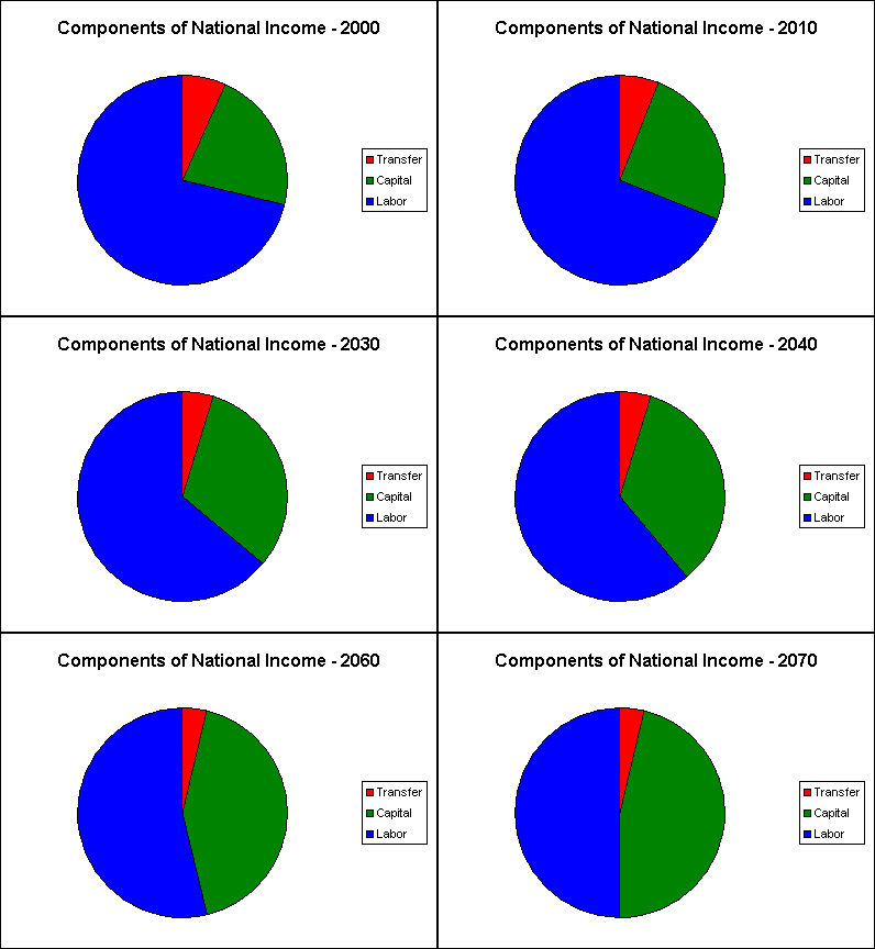 http://www.faireconomy.org/econ/state/Talking_Taxes/short%20answers%20only.html. Winning Responses to Tough Tax Questions by Marty Liebowitz - May 12, 2003 http://heartheissues.com/ Hear the Issues has a good number of useful statistics and demographics neatly collected in one place. http://www.inequality.org An excellent website covering the important economic issues that America faces today. Highly recommended. http://www.ctj.org Citizens for Tax Justice is an excellent organization that is accurately taking on taxation issues in America. http://www.progressreport.org The Center for American Progress: excellent summaries of current political issues. http://memory.loc.gov/ Library of Congress - American Memory Page http://www.census.gov US Census Bureau website. http://foia.fbi.gov/room.htm US Freedom of Information Act Archives. http://users.erols.com/mwhite28/20centry.htm Historical Atlas of the 20th Century. This is an excellent site with loads of graphs, maps, and data that cover many aspects of the 20th century. http://www.pbs.org/fmc/book.htm The First Measured Century; a statistical analysis of the 20th century. http://www.etymonline.com/cw/apologia.htm One of the best websites I have seen that covers the issue of the Slavery in America and the Civil War. The site covers the subject objectively with from a factual and economic perspective with many historical references. http://www.taxhistory.org/default.htm A site with an in depth look at the history of taxation in America. http://www.thisnation.com/library/antifederalist/ A site hosting the Anti-Federalist Papers, which are the collection of papers written in opposition to the Constitution of the United States prior to its ratification and in opposition to the Federalist Party of Alexander Hamilton. http://www.huppi.com/kangaroo/1THE_REAGAN_YEARs.htm • The Reagan Years: A Statistical Overview -- Over 150 charts debunking the Reagan Myth and supply-side economics. Includes an in-depth statistical comparison of the United States to other rich (and more liberal) countries, showing how the U.S. comes in last on almost every important list. |
| Refresh | 0 Recommendations | Printer Friendly | Permalink | Reply | Top |
| FogerRox
|
Fri Nov-17-06 09:56 PM Response to Original message |
| 1. SAme vein, much simpler: |
| Printer Friendly | Permalink | Reply | Top |
| papau
|
Sat Nov-18-06 12:54 AM Response to Reply #1 |
| 2. Nice article - the Heritage high tax rates do not raise move revenue lie is |
|
Edited on Sat Nov-18-06 12:56 AM by papau
an example of charting the tax loophole effect on the taxes of the rich, and calling it the result of the tax rate,
Easily shown to be a lie. The only truth in the Heritage data is the fact that the rich can buy laws - in this case tax loopholes - such that 90% and 70% tax rate never hit them head on. They expose perhaps 10% of their income to such rates, hiding the rest via tax loopholes, and pay an effective overall tax rate that is barely double digit. Indeed it seems we are supposed to ignore the great compromise of '86 - the trade of higher tax rates going to lower tax rates in return for loophole closing. |
| Printer Friendly | Permalink | Reply | Top |
| FogerRox
|
Sat Nov-18-06 05:01 PM Response to Reply #2 |
| 3. I think the research you did goes into far greater depth than I did |
|
I wanted to keep it simplish & tie it together with an overiding theme:
Democracy needs a middle class... the 3 pillars of a middle class are Prog taxes, Education, and labor rights. |
| Printer Friendly | Permalink | Reply | Top |
| papau
|
Sun Nov-19-06 12:33 AM Response to Reply #3 |
| 4. I agree :-) |
|
:-)
|
| Printer Friendly | Permalink | Reply | Top |
| FogerRox
|
Sun Nov-19-06 05:29 PM Response to Reply #4 |
| 5. Kickin |
| Printer Friendly | Permalink | Reply | Top |
| DU
AdBot (1000+ posts) |
Sun May 04th 2025, 07:17 AM Response to Original message |
| Advertisements [?] |
| Top |
| Home » Discuss » Topic Forums » Democrats |
|
Powered by DCForum+ Version 1.1 Copyright 1997-2002 DCScripts.com
Software has been extensively modified by the DU administrators
Important Notices: By participating on this discussion board, visitors agree to abide by the rules outlined on our Rules page. Messages posted on the Democratic Underground Discussion Forums are the opinions of the individuals who post them, and do not necessarily represent the opinions of Democratic Underground, LLC.
Home | Discussion Forums | Journals | Store | Donate
About DU | Contact Us | Privacy Policy
Got a message for Democratic Underground? Click here to send us a message.
© 2001 - 2011 Democratic Underground, LLC