| Latest | Greatest | Lobby | Journals | Search | Options | Help | Login |
|
|
|
This topic is archived. |
| Home » Discuss » Archives » General Discussion (01/01/06 through 01/22/2007) |
|
| The Backlash Cometh
|
Tue Jan-02-07 04:55 AM Original message |
| A symbol for Impeachment. |
| Printer Friendly | Permalink | | Top |
| valerief
|
Tue Jan-02-07 09:01 AM Response to Original message |
| 1. I think your idea is just peachy. nt |
| Printer Friendly | Permalink | | Top |
| The Backlash Cometh
|
Tue Jan-02-07 09:32 AM Response to Reply #1 |
| 5. Let's hope everybody goes bananas over it. |
| Printer Friendly | Permalink | | Top |
| liberaldemocrat7
|
Tue Jan-02-07 10:23 AM Response to Reply #5 |
| 12. Check your private mail here backlash. |
| Printer Friendly | Permalink | | Top |
| mwb970
|
Tue Jan-02-07 09:06 AM Response to Original message |
| 2. Maybe use a "Peach Bush" or something. /nt |
| Printer Friendly | Permalink | | Top |
| The Backlash Cometh
|
Tue Jan-02-07 09:31 AM Response to Reply #2 |
| 4. A peach bush? |
| Printer Friendly | Permalink | | Top |
| radfringe
|
Tue Jan-02-07 09:17 AM Response to Original message |
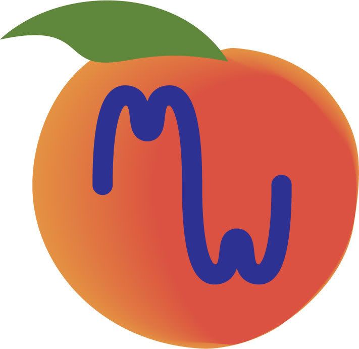
| 3. like this? |
| Printer Friendly | Permalink | | Top |
| The Backlash Cometh
|
Tue Jan-02-07 09:33 AM Response to Reply #3 |
| 6. I think it's a start. Can someone turn it into an Avatar? |
| Printer Friendly | Permalink | | Top |
| Alamom
|
Tue Jan-02-07 09:44 AM Response to Reply #6 |
| 7. ok, an example to see how it looks "much" smaller. |
| Printer Friendly | Permalink | | Top |
| The Backlash Cometh
|
Tue Jan-02-07 09:50 AM Response to Reply #7 |
| 8. Maybe the writing should be on the outside, so it stands out? |
| Printer Friendly | Permalink | | Top |
| whyzayker
|
Tue Jan-02-07 10:07 AM Response to Reply #8 |
| 9. How's this look? |
| Printer Friendly | Permalink | | Top |
| The Backlash Cometh
|
Tue Jan-02-07 10:09 AM Response to Reply #9 |
| 10. It's acceptable. |
| Printer Friendly | Permalink | | Top |
| whyzayker
|
Tue Jan-02-07 10:20 AM Response to Reply #10 |
| 11. Download it to your 'puter and.. |
| Printer Friendly | Permalink | | Top |
| radfringe
|
Tue Jan-02-07 10:30 AM Response to Reply #10 |
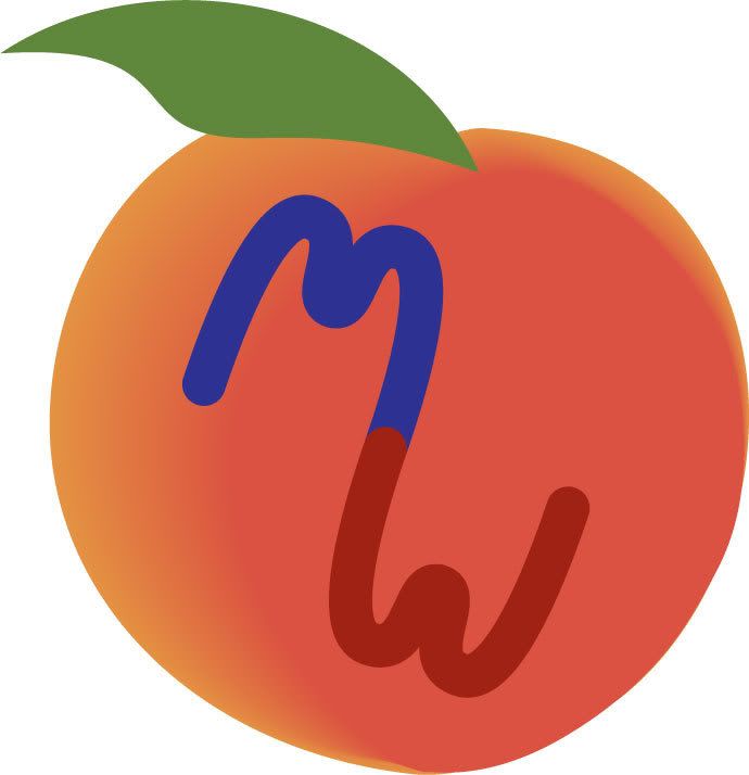
| 13. changed color of text to white |
| Printer Friendly | Permalink | | Top |
| The Backlash Cometh
|
Tue Jan-02-07 10:41 AM Response to Reply #13 |
| 14. How do ah Looook? |
| Printer Friendly | Permalink | | Top |
| radfringe
|
Tue Jan-02-07 11:18 AM Response to Reply #3 |
| 16. another variation |
| Printer Friendly | Permalink | | Top |
| The Backlash Cometh
|
Tue Jan-02-07 12:06 PM Response to Reply #16 |
| 17. I like the way the wording drapes the circle. |
| Printer Friendly | Permalink | | Top |
| radfringe
|
Tue Jan-02-07 12:29 PM Response to Reply #17 |
| 20. problem is in the concept of using a peach |
| Printer Friendly | Permalink | | Top |
| thecrow
|
Tue Jan-02-07 10:50 AM Response to Original message |
| 15. How about this? |
| Printer Friendly | Permalink | | Top |
| The Backlash Cometh
|
Tue Jan-02-07 12:07 PM Response to Reply #15 |
| 18. Wow. |
| Printer Friendly | Permalink | | Top |
| valerief
|
Tue Jan-02-07 12:18 PM Response to Reply #18 |
| 19. Better would be the M then the peach then the W. nt |
| Printer Friendly | Permalink | | Top |
| Jack Rabbit
|
Tue Jan-02-07 12:36 PM Response to Original message |
| 21. I'm a bit of a minimalist |
| Printer Friendly | Permalink | | Top |
| The Backlash Cometh
|
Tue Jan-02-07 05:33 PM Response to Reply #21 |
| 23. No prob, with me. |
| Printer Friendly | Permalink | | Top |
| WritersBlock
|
Tue Jan-02-07 02:20 PM Response to Original message |
| 22. Anyone's welcome to my avatar if they want it. |
| Printer Friendly | Permalink | | Top |
| The Backlash Cometh
|
Tue Jan-02-07 05:35 PM Response to Reply #22 |
| 24. I think this is going in the right direction. |
| Printer Friendly | Permalink | | Top |
| WritersBlock
|
Wed Jan-03-07 12:00 AM Response to Reply #22 |
| 26. Here's a larger shot. |
| Printer Friendly | Permalink | | Top |
| WritersBlock
|
Wed Jan-03-07 12:14 AM Response to Reply #22 |
| 27. Another version |
| Printer Friendly | Permalink | | Top |
| WritersBlock
|
Wed Jan-03-07 12:17 AM Response to Reply #27 |
| 28. The angles... gotta work on the angles. |
| Printer Friendly | Permalink | | Top |
| Stardust
|
Wed Jan-03-07 12:29 AM Response to Reply #22 |
| 29. I like it! |
| Printer Friendly | Permalink | | Top |
| WritersBlock
|
Wed Jan-03-07 04:39 AM Response to Reply #22 |
| 30. And yet another version |
| Printer Friendly | Permalink | | Top |
| WritersBlock
|
Wed Jan-03-07 04:46 AM Response to Reply #22 |
| 31. Or maybe something like this one....? |
| Printer Friendly | Permalink | | Top |
| WritersBlock
|
Wed Jan-03-07 05:18 AM Response to Reply #31 |
| 32. And one last try for the morning.... |
| Printer Friendly | Permalink | | Top |
| WritersBlock
|
Wed Jan-03-07 10:24 AM Response to Reply #22 |
| 33. Okay, last one |
| Printer Friendly | Permalink | | Top |
| blogslut
|
Tue Jan-02-07 05:47 PM Response to Original message |
| 25. I gave this as a gift to DU last xmas |
| Printer Friendly | Permalink | | Top |
| DU
AdBot (1000+ posts) |
Sat Sep 07th 2024, 06:42 PM Response to Original message |
| Advertisements [?] |
| Top |
| Home » Discuss » Archives » General Discussion (01/01/06 through 01/22/2007) |
|
Powered by DCForum+ Version 1.1 Copyright 1997-2002 DCScripts.com
Software has been extensively modified by the DU administrators
Important Notices: By participating on this discussion board, visitors agree to abide by the rules outlined on our Rules page. Messages posted on the Democratic Underground Discussion Forums are the opinions of the individuals who post them, and do not necessarily represent the opinions of Democratic Underground, LLC.
Home | Discussion Forums | Journals | Store | Donate
About DU | Contact Us | Privacy Policy
Got a message for Democratic Underground? Click here to send us a message.
© 2001 - 2011 Democratic Underground, LLC