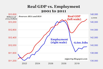
Chart of the Day: Structural Shift in U.S. Economy

I have featured charts similar to the one above that displays real GDP and civilian employment over the last ten years. More than any single chart, I think this one really helps to accurately describe the current state of the U.S. economy:
1. Measured by real output
(GDP), the U.S. economy has
made a complete recovery from the 2007-2009 recession now that real output in Q3 was higher than the 2007 Q4 level when the recession started.
2. While real output has completely recovered to above pre-recession levels,
U.S. employment at 139.6 million is still 6.6 million jobs (and 4.5%) below the 2007 peak of 146.2 million, and that translates into the ongoing "jobless recovery."
3. The recovery of real output to historical highs with 4.5% fewer employees has also translated into
record-level corporate profits, which are now almost 40% above pre-recession levels.
4. The recovery of both output and profits to above 2007 levels with 6.6 million fewer workers could explain the sluggish job growth that will probably continue for several more years.
If companies can produce more output now than in 2007 with fewer workers and record profits, where's the incentive to hire more workers?
The Great Recession stimulated huge productivity and efficiency gains as companies shed marginal workers and learned how to do "more with less (fewer workers)." The surge in productivity over the last few years may be unprecedented in recent history and may be responsible for a "structural shift" in the U.S. economy that will have long-lasting effects, e.g. an extended period of time with a jobless rate above 7% http://mjperry.blogspot.com/2011/11/chart-of-day-structural-shift-in-us.html